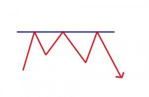
Flags and Pennants are categorized as a continuous pattern. They normally represent only brief pauses in a dynamic stock. They’re typically seen immediately after a quick move. The stock will then take off again in the same direction. Research shows that these patterns are many of the most reliable continuation patterns. Take a look at typical Flag and Pennant pattern.
Bullish flags are identified with lower tops and lower bottoms, and with the pattern slanting against the trend. However unlike wedges, their trend lines run parallel.
Bearish flags are made up of higher tops and higher bottoms. Bear flags will also have a inclination to slope against the trend. Their trend lines run parallel as well.
Pennants look a lot like a symmetrical triangle. However pennants are normally smaller in size (volatility) and duration. Volume in most cases contracts during the pause with an increase on the breakout.
HERE IS A SAMPLE CHART WITH A FLAG & PENNANT PATTERN
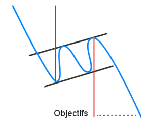
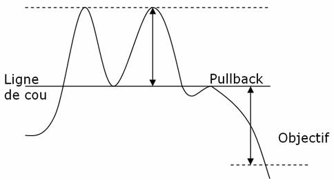
The V top is a reverse V-shaped top thus the name. The top is quite sharp. It’s due to the irrationality of actors leading to a steep increase that will be corrected shortly afterwards. The V top will occur most often in an upward trend and will often signal a trend reversal. It can also appear in a downward trend, like when in an economic announcement.
The neckline of the pattern is formulated by the lowest point before the formation of the reverse V.
The general objective of the V Top pattern is the distance between the neckline and the lowest of the reverse V that extended to the neckline.
Various criteria is used to identify a V top:
– The highest point of the reverse V is often formulated by a single candle, often with a long upper shadow that underlines the reversal willingness of investors.
– The sharp upward movement that forms the reverse V is led by a steep upward slant. The price will make any pause during the bullish movement.
– The angle of the line that leads the bearish reversal should be similar to the angle of the line that led the bullish downtrend.
– It is quite difficult to anticipate a V top.
– The interest of the pattern is in its reversal potential.
The V bottom is shaped like a V thus the name. The dip will be quite sharp. It’s because the irrationality of actors leading to a steep fall which will be corrected shortly after. The V bottom will occur most often in a downward trend and will generally offer a signal trend reversal. It can also appear in an upward trend (like in an economic announcement).
The neckline of the pattern is formed by the uppermost point prior to the formation of the V.
Here are several criteria that are used to identify a V bottom:
– The lowest point of the V bottom is often formed by a single candle, often with a long lower shadow which underlines the reversal willingness of investors.
– The sharp downward movement that forms the V is guided by a very steep downward slant. The price will often make a pause during the bearish movement.
– The shape of the line that leads the bullish reversal will be nearly identical to the shape of the line that leads the bearish downtrend.
– It is quite difficult to anticipate a V bottom.
– The interest of the pattern is in its reversal potential.
– The V bottom often appears in a channel.
– The upward trend will continue in most cases once the pattern is completed, but in trend.
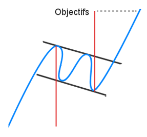
A horizontal channel is a pattern that underlines investor’s indecisiveness. This horizontal channel is assembled by two horizontal and parallel lines that build the progress of the price. To confirm a line, there should be at least two points of contact with the price. The more contact points it will has, the more these will be durable and their breakout will give an substantial buy/sell signal.
The horizontal channel is a familiar chart pattern. It’s found on every time frame. Central to this channel, buying and selling forces are alike and only the breakout of one of the two bands will show an advantage to one of them.
The abstract objective of the pattern will be calculated by extending the length of the channel on the break point.
Check the graphical representation of a horizontal channel:
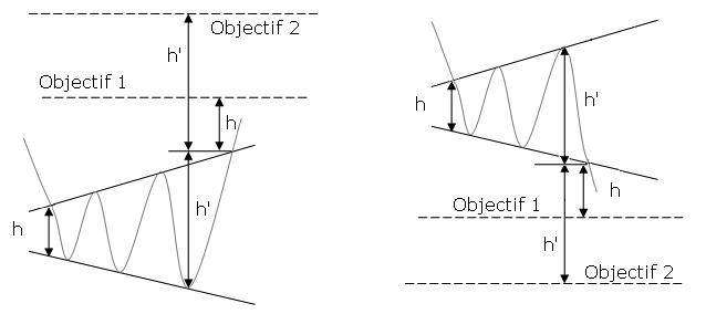
The goal price of this pattern is ascertained by its height from the base of the triangle that’s carried over the break point. Try the technique to draw a parallel line to the support of the symmetrical triangle from the first contact point with the resistance which will help obtain a bullish target price.
The more the horizontal channel is long, the more the movement at the exit will remain strong.
Pullbacks are usual. The breakout will often occur at the 4th contact point.
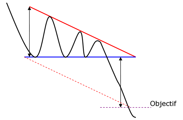
The descending triangle is a bearish continuation pattern. This pattern forms two converging lines. The initial is a downward slant which resistance and the other is a horizontal support. To validate the descending triangle, there must be oscillation between the two lines. The lines must be touched at least twice for validation.
A graphic representation of an descending triangle follows:
The price of this pattern is decided by its height from the base of the triangle that is carried over the break point. A technique used is to draw a parallel to the support line of the descending triangle from the first contact point with the support
This pattern is difficult to classify. Indeed, the exit is bearish just over half the time. So this is a continuation pattern but may also be a reversal pattern symbolizing a buying accumulation zone. Bullish movements are also more important than downward movements.
Look at these statistics about the descending triangle:
– In 54% of cases, there is a bearish breakout.
– In 54% of cases, the target price can be reached when the support is broken. But when the bearish slant is broken, the percentage goes up to 84%.
– In 64% of cases, a pullback occurs on the support.
Over half the time, when a breakout does occur from the bottom, the exit will be made by the top. However, false breakouts by the top are rare with only 6%.
The exit often occurs at the 2/3 portion of the pattern. This is the output level that offers the best performance.
The target price of the pattern is often reached before the end of the triangle.
False breaks will give no indication on the true side of the exit.
Try to avoid taking a position if the breakout occurs before the 2/3 of the pattern.
Pullbacks can be harmful for the performance of the pattern.
The symmetrical triangle top is a bullish continuation pattern. This pattern forms two trend lines which are symmetrical to the horizontal and convergent. The initial pattern is a bearish slant that gives resistance and the other is a bullish slant that will be the support. To prove a symmetrical triangle top, one must have oscillation between the two lines. Each of these lines must be touched at least twice for validation.
Asymmetrical triangle “top” is necessary for the movement that precedes the formation of the triangle being bullish.
A graphical representation of a symmetrical triangle top is below:
The objected price of this pattern will be determined by its height from the base of the triangle that is carried over the break point. A technique you may use is to draw a parallel line to the support of the symmetrical triangle from the first contact point with the resistance in order to obtain a bullish target price.
Some statistics about the symmetrical triangle top are:
– In 63% of cases, there is an upward exit.
– In 89% of cases, the bearish movement will continue after the breakout.
– In 81% of cases, the target price will be reached in case of a bullish breakout.
– In 60% of cases, a pullback occurs.
– In 70% of cases, bullish breakouts will occur when the price is moving into the highest third of its annual range.
– In 16% of cases, there will be false breakouts.
The exit normally happens towards 80% of the distance of the pattern.
Sharping and strong breakouts will give a better performance.
A performance is better when the triangle is formed at the beginning of a trend.
Try to avoid taking a position if the breakout occurs before 3/4s of the pattern.
Pullbacks can be harmful for the performance of the pattern.
A symmetrical triangle bottom is a bearish continuation pattern. This pattern forms two trend lines that are symmetrical to the horizontal and convergent. The initial one is a bearish slant that gives support and the other will be a bullish slant that will create a resistance. To prove a symmetrical triangle bottom there must have oscillation between the two lines. Each line has to touch at least twice for validation.
A symmetrical triangle “bottom” is necessary so the movement that preceded the formation of the triangle is being bearish.
A graphical representation of a symmetrical triangle bottom is below:
The price of this pattern will be determined by its height from the base of the triangle so that its carried over the break point. A similar technique is to draw a parallel line from the resistance of the symmetrical triangle to the first contact point with the support which will obtain a bearish target price.
Some statistics about the symmetrical triangle bottom are:
– In 57% of cases, there is an downward exit.
– In 91% of cases, the bullish movement will continue after the breakout.
– In 57% of cases, the target price will be reached in case of a bearish breakout.
– In 60% of cases, a pullback occurs.
– In 16% of cases, there will be false breakouts.
The exit normally occurs towards 80% of the distance of the pattern.
A sharping and strong breakout gives better performance.
The performance is greater when the triangle is formed at the beginning of a trend.
Be sure to avoid taking a position if the breakout occurs before 3/4s of the pattern.
Pullbacks are harmful for the performance of the pattern.
The ascending triangle is a bullish continuation pattern. This pattern is made by two converging lines. The first line is an upward slant which is the support and the other is a horizontal resistance line. To validate the ascending triangle, there has to be an oscillation between the two lines. Each line has to be touched at least twice for validation.
Here is an ascending triangle chart:
The target price of the ascending triangle is decided by its height from the base of the triangle that is carried over the break point. A similar technique is to draw a parallel to the support line of the ascending triangle from the first contact point with the resistance.
Several statistics about the ascending triangle are:
– In 62% of cases, there is a bullish breakout. – In 75% of cases, the target price will be reached. – In 60% of cases, a pullback occurs on the resistance. – In 25% of cases, there can be false breakouts.
The exit often occurs at 2/3 of the pattern; this is the output level that offers the best performance.
The target price of the pattern is normally reached prior to the end of the triangle.
Any false breaks give no indication on the true side of the exit.
Try to avoid taking a position if the breakout occurs before the 2/3 of the pattern.
Pullbacks are harmful for the performance of the pattern.
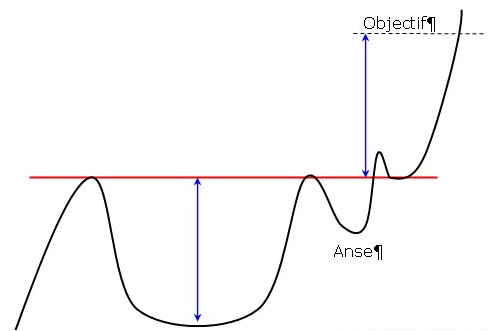
The cup and Saucer has a continuous pattern. This pattern is formed by two rounded bottoms, the first is deeper and wider than the second. The height of the cup and the handle will be aligned along a straight horizontal resistance. This is the neckline of the pattern.
A few rules must be noted for the pattern to be valid.
The Cup and Saucer has to be preceded by a significant upward movement. The lowest at the bottom of the cup has to be less than 50% of the upward movement preceding the pattern. The lowest at the bottom of the handle must be less than 50% of the height of the cup.
The shape of the two bottoms of a rounding bottom reflect the gradual breathlessness of sellers. Buyers take advantage once the neckline breaks (psychological threshold), the purchasing power will become very strong.
The target pattern is calculated by plotting the height of the cup at the break point. But it is more advisable to defer only half the height of the cup according to the studies of T. Bulkowki.
Here is a graphic representation of a cup with handle:
Statistics about the cup with handle are:- In 79% of cases, the exit is upward.
– In 73% of cases, the target advised for this pattern is reached (half the height of the pattern).
– In 74% of cases, a pullback occurs on the neckline.
OJ Neil, the inventor of this pattern mentions that the objective to increase is very important and you must let the trade that’s going on to allow all the movement. This pattern is a major continuation pattern. The long-term upside potential is quite important.If the cup pattern has a right side below the right side, giving an ascending neckline, this performance pattern is again important.It is advisable to wait for the pullback to take a stand. Pullbacks have a negative impact on performance.
The rounding top pattern is a reverse U-shape, also called a “reverse saucer. ” The top is rounded with a flat top. But as you’ll see in many cases there are several bullish peaks and they will not put in question the validity of the pattern.
The neckline of the pattern is constructed by the lowest point before the formation of the reverse U. A rounding top can be a bullish continuation pattern but also a downward continuation pattern.
A graphical representation of a rounding top is indicated below:
Differing from the rounding bottom, the target price will be calculated using the classic balance rule. It’s calculated by measuring the depth of the reverse U and then reporting it on the neckline.
The rounding top has been discussed as a reversal pattern. But the work of T. Bulkowski indicates that in many cases the rounding top is a continuation pattern. Take a look at the graphical representation of a reversal rounding top.
Some of the statistics about the rounding top are noted:
– In 81% of cases, there will be a bullish continuation pattern.
– In 61% of cases, the exit is upward.
– In 70% of cases, the target advised for this pattern will be reached.
– In 48% of cases, a pullback occurs on the neckline.
– In 90% of cases, there is a search of the bullish movement after the breakout of the neckline.
The price frequently makes a break when the price gets back on the neckline.
The more the top is flat, the more movement there is at the breakout of the neckline.
Provided that there is a pullback on the neckline after the breakout, the downward movement will be less powerful.
If a significant downward spike occurs after the formation of the top, it is plausible to draw an upward line to connect the low point prior to the formation of the rounding top and the lowest of the bearish peak.
The U-shaped bottom is a rounding bottom, also called a “saucer. ” The dip is rounded with a flat bottom. But we’ll see in many cases there are several bearish peaks, but they do not question the validity of that pattern.
The neckline of the pattern is assembled by the highest point before the formation of the U.
Here is a graphical illustration of a rounding bottom:
There is no theoretical target price. Some authors will measure the depth of the U and then report it on the neckline like a double bottom. It is not a good suggestion to apply this method, actually the target is then reached in only 36% of the cases. The theoretical objective that is suggested, is to measure the depth of the U then divide by 2, to postpone this height on the neckline.
The rounding bottom reversal pattern has been lengthily considered. Consider the work that T. Bulkowski demonstrates that in a lot of cases the rounding bottom is a continuation pattern. When the neckline is broken, the results are quite good.
Here are some statistics about the rounding bottom:
– In 62% of cases, there will be a bullish reversal.
– In 86% of cases, the exit is upward.
– In 57% of cases, the target advised for this pattern will be reached .
– In 40% of cases, a pullback will occur on the neckline.
– In 95% of cases, there is a pursuit of the bullish movement after the breakout of the neckline.
The price will often make a break when the price gets back on the neckline.
The more the dip becomes flat, the more the movement at the breakout of the neckline will be strong.
If there is a pullback on the neckline after the breakout, the upward movement will be then less powerful.
If a significant upward spike occurs after the formation of the bottom, it is possible to draw a downward line to connect the high point prior to the formation of the rounding bottom and the highest of the bullish peak.
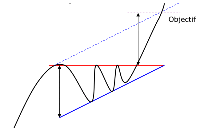
The pennant resembles the symmetrical triangle, but it’s characteristics are not the same. The pennants is shaped like a wedge of consolidation. Its normally appears after a sudden upward or downward movement. The life of a pennant is short according to the time frame used.
The pennant’s pattern is a continuation pattern. The exit side of a pennant depends on the preceded movement. The formation of the pennant may intervene in a bullish or bearish trend. This break will occur halfway of the movement.
The target calculation is compared to the prior trend. You should calculate the height of the entire movement, up or down before the formation of the pennant and then extend the high on the last low/high point of the pattern.
A graphical representation of a pennant follows:
Several statistics about the pennant are:
– In 75% of cases, the exit is made in the side of the previous trend. – In 90% of cases, this will be a continuation pattern. – In 55% of cases, the target of the pattern has been reached. – In 16% of cases, a pullback occurs. – 84% of cases, a pennant occurs on the lower third annual range when the trend is bearish and the highest third when the trend is bullish.
The more the movement prior to the formation of the pennant is powerful, the more the movement following the exit will be strong.
A pennant with a narrowed base is much more powerful than a pennant with a wide base.
A pennant is more powerful if there are no false breakouts.
Pullbacks are harmful for the performance of the pennant pattern.
The descending flag shows as a continuation pattern. The flag is built by two straight downward parallel lines which is shaped like a rectangle. It is oriented in the direction of that trend which it consolidates. Contrary to a bearish channel, this pattern is quite short term and shows the fact that buyers will need a break.
The creation of an descending flag will occur in an upward trend. Often, this break will occur halfway through the movement.
The object calculation will be compared to the previous trend. A calculation of the height of the overall upward trend before the formation of the descending flag and then extends the low on the last lowest point of the pattern.
A graphical representation of a descending flag follows:
Look at some statistics about the descending flag:
– In 87% of cases, there is an upward exit.
– In 90% of cases, the descending flag shows a continuation pattern.
– In 62% of cases, the target of the pattern will be reached .
– 76% of cases, the descending flag occurs when the price is at the highest third of its annual range.
– In 10% of cases, a pullback occurs on the support.
The more the previous movement precedes the formation of the descending flag it is powerful, the more the bullish breakout will be strong.
The performance of a descending flag is not as important when it is oriented in the direction of the trend.
A descending flag with narrowed lines is performs more than a flag with outspread lines.
A descending flag is more powerful if there is no false breakout.
An ascending flag is a continuation pattern. The ascending flag is formed by two straight upward parallel lines which are shaped like a rectangle. It is adjusted in the direction of the trend that it consolidates. Contrary to a bullish channel, this pattern is quite short term and marks the fact the seller will need a break.
The formation of an ascending flag will occur in a downward trend. Often, this break will occur halfway through the movement.
The target calculation will be compared to the previous trend. A calculation of the height of the overall downward trend is before the formation of the ascending flag and then extends higher on the last highest point of the pattern.
A graphical representation of an ascending flag follows:
Here are some statistics about the ascending flag pattern:
– In 87% of cases, there will be a downward exit. – In 90% of cases, the ascending flag is a continuous pattern. – In 62% of cases, the target of the pattern is reached . – In 76% of cases, the ascending flag occurs when the price is at the lowest third of its annual range. – In 10% of cases, a pullback occurs on the support.
The more the previous movement precedes the formation of the flag holds powerful, the more the bearish breakout will continue to be strong.
The performance of an ascending flag is much less important when it is oriented in the direction of the trend.
A flag with narrowed lines is more performing than a flag with outspread lines.
A flag is more powerful if there is no false breakouts.
A bullish channel is called a continuation trend pattern. The bullish channel is assembled by two parallel lines that frame the upward price trend. A line is validated when there has been at least two points of contact with the price. The more contact points it has, the stronger the trend line is and the more their breakout will give a strong sell signal.
The bullish channel is one of the most used chart patterns. You can find it on every time frame. There is no theoretical target in this pattern. The movement can continue as far as the lower band is supported.
Here is a graphical representation of a bullish channel:
It is not recommended to take a short position at the contact with the upper band. Actually the trend may continue along the upper band. Besides, the movement towards the lower band are correction movements into an upward trend and are therefore less powerful.
Try to avoid false breakouts by drawing your trend lines based on high and low points of candlesticks and not their body.
The breakout often occurs at the 4th point of contact.
The more the lower band acts as support, the more the breakout will be violent.
A bearish channel is a continuation trend pattern. The bearish channel is arranged by two parallel lines that frame the downward price trend. To certify a line, there has to be at least two points of contact with the price. The more contact points it has, the more the trend line is stronger and their breakout will give a stronger buy signal.
The bearish channel one of the most used chart patterns. You can find it on every time frame. There is no theoretical target in this pattern. The movement can continue as far as the upper band is resistance.
Here is a graphical representation of a bearish channel:
It isn’t a good idea to take a long position at the contact with the lower band. Actually the trend might continue along the lower band. Also the movements towards the upper band are correction movements into a downward trend and as a result are less powerful.
To avoid false breakouts, draw your trend lines based on high and low points of candlesticks and not their body. The breakout will often occur at the 4th point of contact.
The more the upper band acted as resistance, the more the breakout will be violent.
The triple top is a bearish pattern with an MN shape. Three bottoms will come in succession, reflecting an important resistance. This marks a reversal will.
Below the triple top shows the area of resistance that will lead to a correction of the price three times. The neckline pattern will be formed by the lowest of these two bearish peaks. An initial correction will then occur and, then the price will go back on resistance. The magnitude of these three tops are normally the identical (as in the case below), but it may happen that the first top may be lower than the next two tops. This composition strengthens the validity of the pattern since it reflects a breathlessness of buyers. If the second top is higher than the two others, it could be a head and shoulders pattern.
Another correction will take place, theoretically on the same level as the first correction. Provided that the neckline is broken at this point, then it can be a double top. In many instances we know afterward what type of pattern we will face. A return on the resistance must be done. If the third top were higher than the first two, then that would reinforce the chances of reversals (breathlessness of buyers). The third correction that will lead to the breakout of the neckline and will validate the bearish reversal.
Once this neckline is broken, it could happen that the price will take resistance on it (that line becomes a resistance, called a pullback), then the price will take up its bearish movement. A target price will be determined by the gap between the resistance and the neckline.
Another example of a triple top with a breathlessness of buyers (top are less and less high) is provided.
Following are are several statistics about the triple top:
– In 85% of cases, there is a downward exit.
– In 50% of cases, the target of the pattern is reached once the neckline is broken.
– In 84% of cases, a pullback will occur.
– In 85% of cases, there is a pursuit of the movement once the neckline is broken.
In case of pullback, the downward movement may not be as important once the target of the pattern is reached.
If the resistance is overly tested prior to a correction (flat top), then the decrease following the breaking of the neckline will be more important.
The more the three tops are close, the more of the percentage of success of the pattern is high.
The more the movements between the neckline and resistance are straight, the more the pattern is efficient.
The more the bullish movement proceeds the formation of the triple top is big, the more the downward movement at the breakout of the neckline will be strong.
The pattern is more efficient if the third top is not as high as the other two.
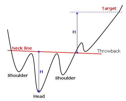
Reverse head and shoulders is a trend reversal pattern. It will mark a desire to make a bullish reversal. The theory is the same as a triple bottom other than the second bottom will be lower than the others, which are technically at the same height. The reverse head and shoulders pattern will be formed by three bottoms that will succeed.
The first and third bottoms are around the same height. It’s said that they formed the shoulders. The second top is lower than the other thus representing the lowest point. This is the head. There are few rules for many investors say that the height of the head should be 1.5 or 2 times lower than the shoulders. Investors also agreed that spacing between each bottom has to be the same. This is a major point to identifying patterns.
The highest attained between the shoulders and the head shape the neckline (in red below) that acts as a resistance. The neckline can be ascending (38% of cases), descending (40% of cases) or horizontal (22% of cases). This is the breakout of the resistance that validates the reversal patterns. The target price is equal in distance between the neckline and the bottom of the head that we symmetrically carry over to the neckline. This pattern is well known to investors and that is what makes it successful.
The reverse head and shoulders pattern offers a good performance on a bearish trend.
Some statistics about the reverse head and shoulders follows:
– In 98% of cases, there is an upward exit.
– In 97% of cases, there is a pursuit of the bearish movement at the breakout of the neckline.
– In 74% of cases, the target of the pattern is reached once the neckline is broken.
– In 52% of cases, a pullback occurs on the neckline.
The trend before the formation of the reverse head and shoulders is long, then the upward movement at the breakout of the neckline shall be strong.
The movement prior to the formation of the reverse head and shoulders is brutal, the upward movement at the breakout of the neckline will be very important.
Patterns with an descending neckline will give a better performance.
If the left shoulder is over the right shoulder, the pattern gives better performance.
Pullbacks on the neckline may be harmful to the performance of the pattern.
The double top is a bearish pattern shaped like an M. Two tops must succeed, imaging an important resistance. This marks a reversal. The pattern may also be in WV shape. We can consider a triple top as well.
The initial correction will decide how the neckline is evidenced by the lowest between the two tops. Consequently, the price will return to the resistance. The degree of the two or three tops will normally be the same (as our example below shows), however it may happen that the first top will be higher than the first one. This configuration will reinforce the validity of the figure since it will reflect a breathlessness of the buying movement. A third rebound could happen, but in all cases, it is the breaking of the neckline that should validate the bearish reversal.
Once the neckline is broken, it could happen that the price will get back to it (this line becomes the resistance), then will decrease again. The potential of this decrease is determined by the difference among the beginning resistance and of the neckline.
Following are several statistics about the double top:
– In 75% of cases, there will be a bearish reversal.
– In 71% of cases, the target of the pattern is reached once the neckline is broken.
– In 61% of cases, a pullback will occur.
– In 83% of cases, there is a pursuit of that movement once the neckline is broken.
In case of pullback, the upward movement will be less important once the target of the pattern is reached.
When more the two bottoms are closed, the more the percentage of success of the pattern is important.
The more the bullish movement that precedes the formation of the double top is important, the more the downward movement at the breakout of the neckline will be powerful.
A reversal pattern is called a diamond bottoms. This pattern is formulated by two juxtaposed symmetrical triangles. It is shaped like a diamond.
Diamond bottoms must be preceded by a downward trend. This pattern targets the shortness of sellers and consequently investor’s indecisiveness. Similarly, this pattern shows a growing volatility which is gradually reduced towards the end of the diamond.
Oscillations are increasing amplitude and then decreasing thus suggesting a trend reversal. Actually sellers gradually abdicate.
The target of the pattern is figured by plotting the maximum height of the diamond at the exit point. The upward movement is normally faster as the downward trend that precedes it.
Statistics about the diamond bottoms are as follows:
– In 82% of cases, there is an upward exit.
– In 60% of cases, the target of the pattern is reached.
– In 43% of cases, a pull back occurs.
There are three times more diamonds tops than diamonds bottoms.
It occasionally is possible to see an inverted head and shoulders within the diamond bottoms.
This pattern is difficult to see. At the beginning of the diamond formation, the pattern appears like a widening of a symmetrical triangle. But, the symmetrical triangle is a continuation pattern and the diamond is a reversal pattern.
A falling wedge is a bullish reversal pattern made by two converging downward slants. To prove a falling wedge, there has to be oscillation between the two lines. Each of the lines must be touched at least twice for validation.
The pattern labels the shortness of sellers. A characteristic is by a progressive reduction of the amplitude of the waves. The highest will reach during the first correction on the support of the wedge and will form the resistance. Another wave of decrease will then happen, but with lower amplitude, thus displaying the weakness of sellers. A second wave is formulated thereafter but prices will decrease lower and lower at the contact with the resistance. Volumes will then be at their lowest and eventually decrease as the waves. The movement will have almost no selling power which displays the willingness of a bullish reversal.
The target price is presented by the highest point that results in the formation of the wedge.
Check out some statistics about the falling wedge:
– In 92% of cases, there will be a downward exit.
– In 63% of cases, the target of the pattern will be reached once the resistance is broken.
– In 47% of cases, a pullback will occur on the resistance.
– In 27% of cases, false breakout occurs.
The spacing between each contact point on lines is necessary, it is important otherwise it could be a pennant.
More of the trend lines are sloped, the more the upward movement will be violent.
The downward retracement is normally two times faster than the formation of the wedge.
Pullbacks are detrimental to the performance of the pattern.
The breakpoint is normally located around 65% of the length of the falling wedge.
Falling wedges which are bigger give better performance than narrow wedges.
A bearish reversal pattern formed by two assembled upward slants is called a rising wedge. To validate rising wedge there must be oscillation between the two lines. These lines must be touched at least twice for validation.
The pattern indicates the shortness of buyers. This one is identified by a continuous reduction of the amplitude of the waves. The lowest will be reached during the first correction on the resistance of the wedge and will form the support. The second wave of increase will then occur, however with lower amplitude, which may appear the weakness of buyers. Another wave will be formed thereafter but prices will increase less and less at the contact with the support. Volumes will then be at their lowest and constantly decrease as the waves. This movement then has almost no buying power which will indicate the willingness of a bearish reversal.
The target price is given by the lowest point that resulted in the formation of the wedge.
Take a look at some statistics about the rising wedge:
– In 82% of cases, there will be a downward exit.
– In 55% of cases, the rising wedge shows a reversal pattern
– In 63% of cases, the goal of the pattern is reached once the support is broken
– In 53% of cases, a pullback arises on the resistance
– In 27% of cases, false breakouts occur
Note the spacing between each contact point the lines must be important otherwise it could be a pennant.
The more that the trend lines are sloped, the more the downward movement will be violent.
False bearish breakouts provide an indication on the side of the exit because in only 3% of cases, when a bearish breakout occurs, the price will go out of the wedge by the top. The risk of running a false bearish break out is quite low.
An upward retracement is normally two times faster than the formation of the wedge.
Pullbacks will be harmful to the performance of the pattern.
A break point is normally located around 60% of the length of the rising wedge.
Rising Wedges that are large will give better performance than narrow wedges.
Stock charts print different topping formations. Some are classics, like the Descending Triangle, which can be understood and traded with little effort. However the emotional crowd additionally generates many undependable patterns while greed slowly evolves into mindless fear. Complex Rising Wedges will challenge a technician’s best effort at prediction while the unusual Diamond pattern burns trading capital swinging randomly back and forth.
Skilled traders refrain from these fruitless positions and will only look for profits where the odds strongly favor their play. First they’ll locate a common feature discovered in most topping reversals. Price draws at least one lower high within the broad congestion prior to violating a major uptrend. This common double top mechanism will become the focus for their trade entry. From this precise signpost it will follow the price to a natural breaking point and enter when violated.
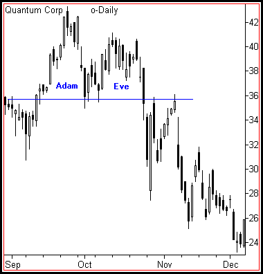
Remember the Adam & Eve Bottom discussed earlier. This unique formation consists of a spiking first bottom, followed by a rounded second one. Flip the pattern around and you will see a highly predictive structure for trading these topping reversals.
This easy Adam & Eve Top gives traders frequent high profit short sales opportunities. Take note of this classic pattern in Quantum’s chart. The price never drew a third high prior to entering a significant bear market.
Successful Adam & Eve short sales may be entered on the first violation of the reaction low, regardless of an underlying trend. Use tight stops to prevent “turtle reversals.” They happen when sharp shorts covering rallies unexpectedly erupt right after the gunning of stops below a violation point.
Every uptrend produces positive sentiment that has to overcome the topping structure. Adam & Eve tops represents an efficient bar structure to succeed in this task. The violent reversal of Adam first awakens fear. Then the slow dome of Eve devours the remaining bull impulse while dissipating volatility needed to resume a rally. As the dome finishes, price moves swiftly to lower levels without substantial resistance.
Observant technicians recognize the mechanics of Descending Triangles and Adam & Eve formations in a lot of complex reversals. The vast majority of tops contain some characteristics of these similar patterns. Crowd enthusiasm will be eliminated for a decline to proceed. Through the repetitive failure of price to achieve new highs, buying interest eventually recedes. Then the market can eventually drop from its own weight.
Double Top Breakdown
Quantum’s 1997 multi-year high breaks down in a dramatic Adam and Eve Top. Pay attention to both volume and volatility readings to decline gradually through the formation of the second rounded high. Often, this “Eve” consumes more price bars than the “Adam” that precedes it.
The formation, ascending broadening wedge is called this because of its similarity to a rising wedge formation and then has a broadening price pattern.
While symmetrical broadening formations have a price pattern that revolves about a horizontal price axis, the ascending broadening wedge differs from a rising wedge as the axis rises.
The upper trend line of an ascending broadening wedge goes upward at a higher rate than the lower one, thus creating an apparent broadening appearance. The ascending broadening wedge formations volume is likely to increase ever so slightly as the breakout advances.
The patterns are very trustworthy once a downside break happens, however they are less reliable prior to the break of the lower trend-line. Thomas Bulkowski’s Encyclopedia Of Chart Patterns notes the failure rate for this pattern formation is 24%, however only 6% where a downside break occurs, suggests that once the downside break happens there is a possibility that a price recovery and a continued decline should be expected.
Once the decline begins prices will most often decline to, or below, the start of the formation.
The two sloping trend lines are the most obvious thing you will notice; the upper one will have a slightly steeper slope than the lower one and the trend lines will then spread out over time while both slope upward. When prices break through the lower trend-line they will tend to drop quickly.
Price movement is contained and alternates between the two non-parallel trend-lines. This is indicated in the below chart.
On many occasions, these formations will appear towards the end of a rising price trend and signal a reversal. A partial rise does not predict a change in trend.
There are quite a number of characteristics that will be unique to ascending broadening wedge formations;
The upwardly tilted megaphone shape.
Both upper and lower trend-lines will slope higher.
The upper trend-line will have a higher slope than the lower one, giving the appearance of a broadening formation.
Each trend-line should have a minimum of three touches, or close to that.
Volume normally rises as prices move up and declines as prices move down.
Volume tends to rise over time in most cases.
If prices do break the lower trend line, the price action may be chaotic and occasionally runs straight through the lower trend-line without even pausing on the way through. The average decline of a confirmed pattern is about 20%
In the case of a partial rise going towards the end of the pattern, prices start moving upward, after having found support at the lower trend-line, then stop prior to touching the upper one. Prices will immediately return to the lower trend-line and normally head lower, breaking towards the downside.
In Thomas Bulkowski’s Encyclopedia Of Chart Patterns, only 6% of the formations breaking out downward will fail to continue moving down by more than 5%. This is an exceedingly low figure. Also there is a 76% chance that the formation will break out downward. It therefore pays to wait for a confirmed breakout.
The measure rule for this type of formation will differ from most other formations in that it will be based on the lowest daily low, not on the height of the formation. The low serves as the expected minimum price move.
Again this formation is a good account for downside breakouts. About 1 in 5 will see prices movement horizontally or even break out upward. Holding out for the downside break is the favorite approach and considerably increases the possibility of a profitable trade.
When prices begin to decline below the lower trend-line, think about a short position and then be prepared to cover when prices approach the target or at the next closest level of price support.
Provided that you identify a partial rise, consider taking a short position since around 8 of 10 cases show a downside breakout following a partial rise, because you will have a ‘heads up’ profits should be larger. If this approach is taken, as the trade advances the lower trend-line, consider tightening your stop-loss in case price reverses, thereby protecting your position.
The right-angled and ascending broadening chart pattern is not one you might choose to trade. Other chart patterns perform much better. Downward breakouts have a big break even failure rate which may disqualify them from your trading tools. Upward breakouts have only a middling average rise, and that is if you trade them perfectly.
Would you trade a pattern with a likely profit potential of 10% or less? Perhaps a bearish chart pattern would appear, and the measure rule for that formation implied a downturn from 2700 to 2550, would you consider pursuing it further?
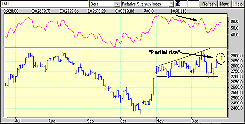
Some of these queries came up when the megaphone-like formation in the Dow Jones Transportation Average was noticed over the last two months. This compilation, with a flat, horizontal bottom and a progression of higher highs as well as a up-sloping trend line, is known as a right-angled broadening formation. Since the pattern is registering higher highs, it is referenced as an ascending broadening formation. However often “ascending” is a bit of a misnomer. Right-angled ascending broadening formations are bearish beasts.
Prior to taking a closer look at the pattern developing in the DJTA, more can be said about right-angled ascending broadening formations. Unlike other chart patterns, right-angled ascending broadening formations have an variable volume trend during the development of the formation, after all a volume surge on the breakout is common. While premature breakouts (upside or downside) tend to be isolated, pullbacks to the horizontal trend line are quite common. Also common are “partial rises” during which prices move toward the up-sloping trend line. These “partial rises” can be indications for a coming breakout, especially on the downside.
Fixed support at 2700 and higher highs in November and December establish this right-angled, ascending broadening formation. The declining relative strength also conveys a bearish retreat for the DJTA. Graphic provided by: MetaStock.
These characteristics are evident with the right-angled ascending broadening formation in the DJTA. The series of higher highs is present; the up-sloping trend line connects the highs of November with those of December. Also notice the steadfastness of the horizontal trend-line, which is hardly penetrated during the pattern’s development over the past two months. The “partial rise” phenomenon also seems to be effected, as the mid-December rally seems to have topped out at 2900.
Possibly one of the reasons why it is recommended that this formation is probably less beneficial has to do with waiting for the downside breakout. In the chart, a downside breakout would suggest a penetration of the horizontal line at 2700. The measure rule for right-angled, ascending broadening formations is sort of prudent, simply measure the distance from the highest high in the formation to the horizontal line at the bottom of the formation, then subtract that value from the horizontal line’s value. In this case, the formation’s high is at about 3000, while the horizontal line at 2700. This should give a formation size of 300 and cause a likely decline to as low as 2400.
The symmetrical broadening bottom is a bullish reversal pattern. The pattern is formed by two symmetrical horizontal lines that are divergent. So it is a inverted symmetrical triangle or an open triangle. The oscillations between the two bands of the triangle are therefore becoming more and more sizable. Each line must be touched at least twice for validation.
The symmetrical broadening bottomshows the growing nervousness of investors but also their indecisiveness. If the pattern is not identified quickly, the movement may seem totally random and thus trapping many investors.
The formation of this pattern should be preceded by an upward movement. This pattern is often due to cheap purchases that will form new highs. However, selling pressure remains strong and the indecisiveness is dominating.
The target price is given by plotting the height of the triangle at its start on the breakpoint. Another technique is to extend the maximum height of the triangle on the breakpoint.
Here is a graphical representation of a symmetrical broadening bottom:
The associated figure shows an example of a broadening bottom chart pattern on the daily scale. Price begins the broadening bottom at A and forms diverging peaks and valleys. At the end of the broadening bottom, C, a partial decline occurs which correctly predicts an upward breakout. This allowed astute traders early entry.
Notice that if you draw the top trendline to connect point B instead of C, the pattern would take on the appearance of a right-angled and descending broadening formation because the top trendline would be flat or nearly so. Also, price at E bounces to D and then makes a lower low at F. Point D looks like a partial rise which fails when the predicted breakout at F does not occur. This is one example of why trading broadening bottoms for profit is difficult, even if relying on a partial decline or partial rise.
Charting Software is an analytical, computer-based tool used to help equity (stock) traders with trading analysis by charting the price stock price for various time periods along with various indicators. Equity charting software packages are used by many traders to determine the direction on any given stock price.
ETFs can be used like financial instrument (such as options and futures) to take long or short positions in investment portfolios. With ETFs, you can scaled down the size of the transaction for small investors. The investment can be tailored with ETFs that invest in currency. Investors can hedge their portfolios against inflation by using commodity prices using targeted ETFs. Investors with limited experience in trading commodity futures can combind precious metals ETFs, oil ETFs and natural gas ETFs – or any commodity covered by an ETF. The advantage of combinding these type of ETFs is the low transaction and holding costs compared to the costs of futures, forwards, options, and other traditional hedging tools. Small investors have huge benefits using ETFs for hedging as they are able to invest in small number of ETFs shares compared to the prior requirement of larger minimum requirements required with traditional hedging strategies.
Definition: Bear ETFs short stocks to achieve their goals. Bear ETFs show gains when the underlying stocks loose value. Bull ETFs use long positions and show gains when the underlying stocks show gains.
More Detail: Most bull and bear ETFs are leveraged. 2x and 3x leveraged ETFs do not guarantee a 200% or 300% return on their underlying index or asset, even though that is the goal. Also, the return is expected on the daily return, not the annual.
3x ETFs use a variety of complex, exotic financial instruments to generate multiplicative returns, both positive and negative. In order to obtain these returns, these ETFs creates long or short equity positions. They invest around 80% of their assets in equity securities which will not generate daily returns of 3x of the target index. To accomplish this, the balance of the fund assets are invested into futures contracts, options on securities, indices and futures contracts, equity caps, collars, and floors, swap agreements, forward contracts, and reverse repurchase agreements.
Definition: The DIA -DIAMONDS Trust, Series 1 ETF invest in a basket of Dow Jones Industrial Average stocks that will track the price and performance of the Dow Jones Industrial Average (DJIA) Index. When you purchase DIA ETF, you are buying a way to diversify your portfolio with large cap stocks. You don’t have to purchase the individual stocks of the DOW to get a diversified portfolio of large cap stocks. Purchasing this ETF gives you the exposure you’re seeking.
More Detail: As for the allocation of stocks, industrial metals represents the largest sector the ETF, followed by the hardware and energy sectors. Media and software are the two smallest industries in the fund as they are primarily found in the NASDAQ.
Many of the companies in this fund are household names. Johnson and Johnson (JNJ), McDonalds (MCD), Coca Cola (KO), Exxon Mobil (XOM), and many other popular companies as well.
A trailing stop loss works similar to a normal stop loss, but the “stop point” can move depending on the highs or lows of the price since you placed your order.. The only difference being that while we calculated our stop loss from the entry price, we’re calculating our trailing stop loss from the highest price since entry. The key to the trailing stop loss is that it tries to keep the same stop rule you originally used, but also protect any future gains that you make.
The method that you use to set your trailing stop loss can vary dramatically. However, if we use the ATR method that we used to calculate our initial stop to set our trailing stop loss, we’ll have the ability to lock in the profit as the share price increases.
For example, if you bought a share of Sprint (S at $5, and your initial stop was set at $4.90, your trailing stop would also have a value of $0.9 to have the same trigger. If, after the first day, the share price moves in your favor and moves to $5.10, you would recalculate your trailing stop loss by subtracting two times the value of the ATR from the new high price of $5.10. For simplicity, let’s assume that your stop size hasn’t changed, and is still ten cents wide. When you calculate your new trailing stop loss, by subtracting the 10 cents from $1.10, it would be set at $5.
At this point, your initial stop was at $4.90, and your trailing stop loss is now at $5, with the share price is at $5.10. Since your trailing stop loss is higher than your initial stop, the initial stop becomes obsolete, and our trailing stop loss becomes your active exit. Want to try it? Click here to trade!
How much profit have you made on this trade? The share price is at $5.10 and we entered at $5. If you thought, No, I haven’t made any money, then you’d be right on track. Remember, our stop loss strategy gives the share price a little bit of room to move.
You’re not going to exit this position until the share price reverts to $5. It is important to note that when you are valuing any open position, you should always value it based on its stop loss value, since if you were to exit this share, you would wait until that price point was breached.
Let’s go back to the example. Now, what happens if the Sprint’s (S) share price begins to fall? Let’s say that the share price falls from $5.10 down to $5.05. What does your trailing stop loss do? Would it move down also? Here’s another important point. A stop loss will never, ever move down. A trailing stop loss can only move up. This ensures you lock in profit and that you’ll also get out of the shares once they start to turn. A trailing stop loss is always calculated from the highest price since entry, so the highest price is still $5.10.
It’s not until the share price makes a new high since entry that the trailing stop loss would begin to move in your favor again. However, if you’re using the ATR method, there’s another way for our trailing stop to move up. This would occur when the volatility of a stock begins to decrease. If a share price were to begin to move sideways, the ATR value would start to drop off. This would cause the trailing stop to move up as the share price became less volatile.
The best way to understand these concepts is to print out a chart with the ATR values along the bottom. Then on the chart, identify the point where you would have received an entry signal, and mark your initial stop loss and your trailing stop loss.
As the trend progresses make sure that you recalculate the value of your stop so you can begin to get a feel for the way this method of using a stop loss works Seeing how the changes in stock price affect you trailing stop loss will give you the confidence to make them a key part of your trading system.
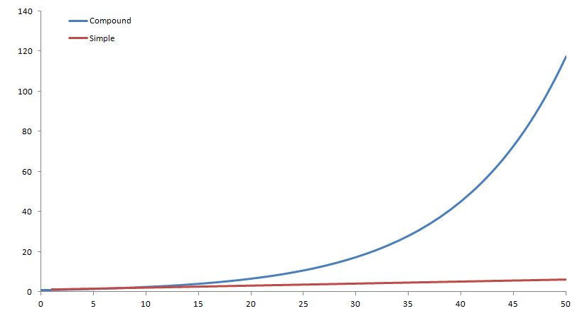
Compound Interest is an extremely important concept in any level of finance. Compound interest can make an enormous difference in the return you get from your investments. As we know, simple interest is the act of earning interest on an investment. If you earned 10% on 100 dollars you would receive 10 dollars every year. On the other hand, with compound interest, that amount grows with interest that you receive. This is true for nearly all investments nowadays, including your bank account!
If you want to see compound interest in action, check out our interactive Compound Interest Calculator, which has charts and graphs that update as you change the saving rules!
An example that is frequently used is the American Indians sale of Manhattan in New York for various items worth about $16. To many that would seem like a very bad deal, since $16 today is not worth much. However, more than 400 years ago, it was a lot of money. If the American Indians had sold the items and invested the money at 8% compounded interest, they would not only have been able to buy back Manhattan today, but would also have a very large leftover of money. This is the real power of compound interest over extended periods of time. You might not have 400 years to save, but even over shorter periods of time, compound interest will add up quickly.
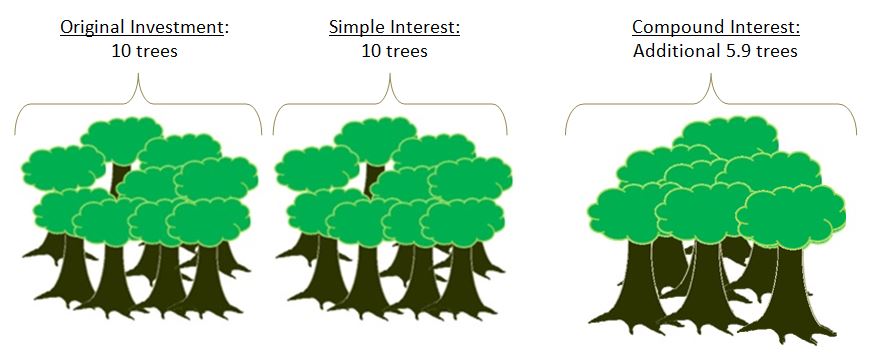
Lets look at an analogy of planting trees that grow and produce other trees that would mimic a ten percent compounded interest. In this example, every tree will grow 10% of a new tree every year.
Year 0: You have saved some money and managed to buy 10 trees and each 10 trees make one tree. Year 1: The next year you will have 11 trees Year 2: The year after that 12.1 trees Year 3: Then 13.3 trees Year 10: After ten years you will 25.9 trees
If this had been simple interest it would have only been twenty trees.
Visually it looks something like this:
This may not seem like much, but if we look at twenty five years of compound interest versus simple interest, compound interest would get an extra 833 trees!
If we look at this graphically, we can see the difference between the two even further.
We can see from the graph above that the compound interest curve looks a little like a hockey stick. This will be true for all compound interest curves and is called an exponential curve. From here it is apparent that after 50 years, compound interest makes a very large difference.
Calculation
The calculation of compound interest is quite simple, but can get more complex when we start changing the compounding period. Here, we will look at the basics for compounding once a year and calculating our interest once a year.
A = P(1 + R)t
Example:
If we have a 5% interest and $100 investment:
Year 1: 105=100 (1+0.05)1 Year 2: 110.25=100 (1+0.05)2 Year 2: 115.76=100 (1+0.05)3 or Year 2: 110.25=105*(1+0.05) Year 3: 115.76=110.25*(1+0.05)
Expiration types determine how long an order will stay open without filling. Your order type is very important for limit orders, but understanding them can also remove a lot of confusion for market orders.
Details
There are many different order types, but we can focus just on a few of them to get a feel for how they work. You may have more or less depending on your brokerage.
Good Till Day
Day, or Good-til-Day, orders will expire at the end of the trading day when the markets close (In the US, it is 4:00 pm ET). If the conditions for your order to fill are not met at the end of the trading day, the order will expire. Market orders are placed as “Good Till Day” by default, with the only condition being that there is sufficient volume in the actual markets for the trade to go through.
Some brokerages allow partial-order filling for market orders, which means that your order will fill to what the volume allows until the market closes, then the remaining part of the order is cancelled at the end of the day.
If a Good Till Day order is placed after hours, it will expire at the end of the next trading day (unless it executes).
Cancel
Cancel, or Good-til-Cancelled (GTC), orders will expire only when you go and manually cancel the order. These orders never expire, meaning they are often popular for stop-loss orders or other very long-term trading strategies.
Date
Date, or Good-til-Date, orders will expire at the date you set, at the end of that trading day when the markets close (In the US, it is 4:00 pm ET). This allows you to keep an order for longer than a day, but you don’t necessarily want it to sit open forever.
An example of this is when you know a company you hold is releasing an earnings report; if the earnings are bad the price starts to really go down, you want to sell it quickly, but if the price doesn’t drop then you would prefer to hold on to it. You could set your stop-loss order to expire the day after the earnings release, which would protect against losses up until that date.
More Complex Order Types
These are more complex orders; you probably will not encounter them with normal brokerage accounts (although some are becoming slightly more common). These are most often used by institutional traders, or professional traders.
Extended
Extended can mean different things depending on who is offering it; usually they are for pre- and after-market trading (for example, stay open until after the after-market trading period on this date)
Fill or Kill
This is a shorter version of “Good Till Day”, this order only stays open for a few minutes. If there is not sufficient volume in the markets to execute, it will cancel.
Immediate or Cancel
This works the same as “Fill or Kill”, except partial order fulfillment is allowed. You will buy up as much of your order as the market will sell you within a few minute (or second) window, and whatever is left is cancelled.
We support many different order types across the system!
What Is An “Order Type”?
When you want to buy or sell a stock, the prices are always moving; the price now could be very different from the price tomorrow. Most investors are concerned with buying and selling stocks only when they are a certain price, the different “Order Types” are the different instructions you give to your broker when placing a trade on how to act based on the price of a stock, mutual fund, option, or other security.
Market Orders
What does it mean?
Placing a “Market Order” means that you want to buy the stock as soon as possible, at whatever the market price is. For example, if you wanted to buy Google (GOOG stock right now because you think the current price is as low as it will go, you would place a Market Order to try to buy it as soon as you can.
Details
Market orders are what most beginning traders use the most; you see the price, and you want to buy or sell at as close to that price as possible. However, someone still needs to “fill” your order for it to go through; just because you want to buy 50 shares of a stock does not mean that there are 50 people willing to sell them to you. This is especially true for penny stocks, which may trade only a couple times a day, or less.
For a market order, it is also possible for you to get a different price for each individual stock you buy. For example, lets say that the “last price” of a stock you want to buy is $100, and you place a market order for 50 shares.
It could be that there is only 10 shares of that stock for sale left at $100, all the other sellers are trying to sell at $120. This means that the first 10 shares you buy will be $100, and the next 40 will be at $120, giving you an average price of $116!
This will never be a problem for big companies, but if you are trading penny stocks, or any other securities with low volume (especially options), this can become a major concern.
Limit Orders
What does it mean?
A “Limit Order” is when you want to buy or sell something, but only at a “Good” price. You can determine what a “good” price is, both for buying and selling
Details
When you are buying, the limit price specifies the highest price you are willing to pay for that stock; if your limit price is already above the current price, it works like a market order
For example, lets say there is a stock you want to buy, its current price is $55. You want to buy it only if the price falls to $50 or below, so you will place a buy-limit order at $50.
Your order will stay open, and if the price falls to $50, it will execute.
For “Sell” orders, it works in the opposite direction: you specific the minimum price you want to sell it at. If the market price goes above that price, your order will execute.
Stop Market Orders (STOP LOSS)
What does it mean?
A “Stop” order is when you want to prevent yourself from losing too much money on a position, which is why the are also called “Stop Loss” orders. For buying, you want to make sure you get it before the price goes too high and you miss out, and for selling you want to sell it before the price drops too low and you lose too much money.
Details
Stop orders work the exact opposite of limit orders, you specificy a “Bad” price and your order will execute if the price falls below that.
For buying, you would use a “Stop” order if you are thinking about buying a stock, but don’t want to buy it until the price starts to go up. In this case, you would set a “Stop” order above the market price, and as soon as the market price goes above your stop price, your order will execute.
For selling, it works as a “loss prevention”, you would set your stop price at the point where you want to sell it if the price keeps falling, because you think that if it falls that far, it will continue falling.
Trailing Stop Orders (STOP LOSS)
What does it mean?
Trailing stop orders follow the market; instead of setting a buy stop order at $50, for example, you would set a “Trailing Stop” order to execute as soon as the price goes up by $1.
Details
At first, this might sound like the same as a normal stop or limit order, but its completely different!
For example, lets say you place a “Trailing Stop” buy order for $1, on a stock with a current price of $100.
If the price falls to $95, but then raises back up to $96, your order will execute because the price went up by $1 from its lowest point since you placed your order. If you are making a long-term strategy where you think a stock is falling now, but want to make sure you buy it as soon as the price starts going back up, a trailing stop order is your best friend.
On the other side, you can use a trailing stop Sell order to make sure you automatically sell off your position if the price starts to fall, no matter how high it goes up first. Many investors prefer to use Trailing Stop Sell orders to regular Stop Sell orders so they can be sure they preserve any gains they have made.
Real-life and the virtual trading hours are the same.
The US and Canadian Markets open at 9:30 AM ET (GMT-6:00) and close at 4:00 PM ET. Monday to Friday, with exceptions on National Holidays.
Mutual Funds orders remain open until the market closes at 4:00 pm ET and execute anywhere between 5:00 and 6:30 pm in general. The price can vary between when you placed your order and therefore the total quantity of shares you receive will likely be different from the estimation when you placed your order. If you did not place your order before the 4:00 pm close of the current day, it will execute at the next day’s available market close.
Can I trade in the Pre- and After-Markets?
We do not offer pre and after markets as they do not have a stated volume, after-market and pre-market trading is usually done by very large institutional investors, or “off exchange” by one investor directy to another; since these trading periods are not available to the typical investors we exclude them for the sake of realism.
!!! Note: All trades execute at near Real-Time price but in the open positions the prices are 15-20 minutes delayed.
Stock market prices are affected by business fundamentals, company and world events, human psychology, and much more
Introduction
Stock market prices are affected by business fundamentals, company and world events, human psychology, and much more.
Stock trading is driven by psychology just as much as it is by business fundamentals, believe it or not. Fear and greed are the two of the strongest human emotions that affect the market. For example, it is easy to get caught in the trap of selling a stock prematurely because it dipped temporarily and fear set in. On the other hand, it is also easy to miss out on a respectable gain because greed was telling you to hold out for more, and then the stock drops back down.
One of the main business factors in determining a stock’s price is a company’s earnings, including the current earnings and estimated future earnings. News from the company and other national and world events also plays a large role in the direction of the stock market. Some examples of this are oil prices, inflation, and terrorist attacks.
Every analyst and trader has a different perception of what that stock price should be now and where it might be in the future, and trading decisions are made accordingly.
Bad News or “Good” Bad News?
Layoffs
This is usually good for the company and its stock price because expenses will be reduced significantly and quickly. This should help increase earnings right away. It is not always a major warning sign; it could just be a reaction to a slower economy. It is one of the quickest ways a company can cut expenses if sales have not been meeting expectations.
Store Closings
This event often causes the stock price to go up for the same reasons as layoffs. However, this is not always the case. Closing stores actually requires a lot of money, and the positive effects of it do not take place immediately. This could be a sign that the company is truly in trouble at the moment. They probably have lower sales and higher expenses than they want, possibly due to a slowdown in the industry or the overall economy. The good news is that their management is being pro-active about maintaining profitability. Unfortunately, the stock price may go down for the next few months.
Firing of CEO or Company Official(s)
This may sound very negative at first, but it does show that the company’s board of directors was bold enough to take drastic actions to help the company in the long run. The stock price could go up or down after this announcement, depending on the situation. In some cases this event could be a sign of corruption that reaches beyond these individuals and there could be more negative announcements to come.
Market Scandals
Traders tend to frown upon corruption in the stock market. Mutual fund scandals that have occurred in the past few years and corporate corruption such as Enron are two such examples. If people cannot trust the stock market, why would they invest their hard-earned money in it? In these situations it is harder for the market to go up because there is a lower demand for stocks.
Analyst Recommendations
Many traders rely on experts’ opinions about companies and future stock prices. Are they always correct? Of course not. Nobody can predict what will happen in the future. They can, however, make educated guesses based on past performances and future prospects for the companies and industries they follow.
Round Numbers
Traders often like nice round numbers for their perceived stock price, such as $10.00 or $35.00. It is common for prices to settle near these round numbers, at least briefly. Also, many traders place automatic buy or sell orders right near these round numbers, causing the stock price to become slightly erratic when it first reaches that target.
Technical Analysis
One of the most popular methods for helping predict a stock’s price, at least in the short term, is called Technical Analysis. This method involves looking for patterns or indicators in stock prices, volumes, moving averages, and many others, over time. Obviously nobody can predict the future but this method can be effective in many cases because human beings are somewhat predictable. For example, when people see a stock start falling dramatically they often panic and sell their positions without investigating what caused the fall. This causes even more people to sell their shares and this often leads to an “overshoot” of the stock price. If you believe the price went too far down you can try to buy it at the bottom and hope that it will come back up to a more reasonable level.
Another common example involves Moving Averages. Many traders like to chart the 50-day and 200-day Moving Averages of their stock prices along with the prices themselves. When they see the current price cross over one of these Moving Averages on the charts it can be an indicator of a change in a long-term trend and it may be time to buy (or sell) the stock.
An order (in finance terms) is to give a broker or brokerage firm instructions to purchase (sell) or short (cover) a security. Traditionally this was done on the phone or even in person directly to the broker or someone under him. Nowadays it is most frequently done online. The orders can vary greatly between choosing market orders, limit orders and stop orders as well as changing how the order will expire.
An order does not mean that you are guaranteed to own (or sell) the stock. It just means that your broker is trying to get it “filled” for you. Filled meaning that they will try and fulfill your order. If, for example, you had a buy order, then your broker will be trying to get you the stocks you wanted to buy and thus “fill” or “execute” your trade. Just like in real life, if you try to buy something no one is willing to sell right now you won’t be able to get it and you will have to wait until someone is willing to sell.
Using Order Types
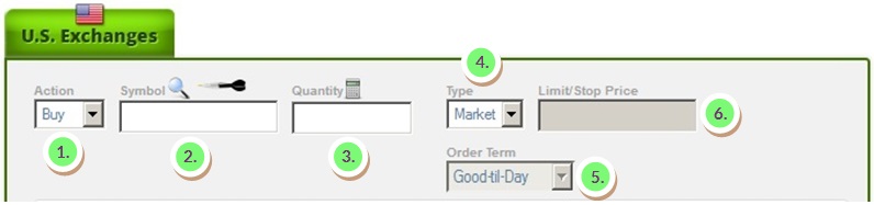
PLACING AN ORDER
Placing an order is easy.
Action: The action will specify whether you are trying to buy, sell, short or cover. You can select this by clicking on the arrow and selecting an item from the drop down menu.
Symbol: By filling the symbol you will get a quote below. If you don’t know the symbol of the company you are looking for you can click on the magnifying glass. If you don’t know that either, you can click on the dart and will give you some ideas!
Quantity:This is the number of shares you want. Don’t worry if your not sure! You can see how much it will tell you your estimated cost below and you can use a slider to change the amount you wish to get, or similarly, just delete the number and write a new number.
Type:This will select the type of order you can select, either a market order, limit order or stop order.
Order Term:This will select the order term.
Good-til Day will try to execute until the end of the trading day at 4:00 pm ET.
Good-til Cancel will try to execute until you cancel the order.
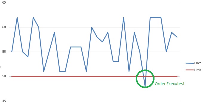
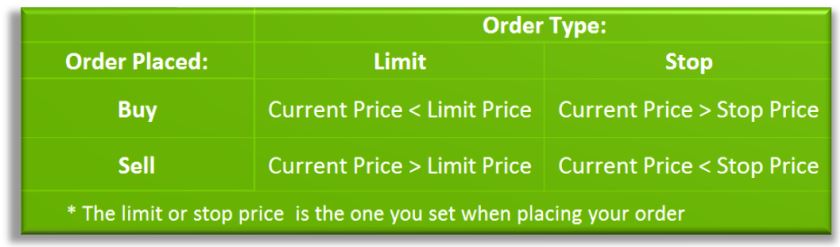
Limit/Stop Price:This specifies the limit or stop price that you are using to execute your trade. The table below is very useful in determining when a limit or stop will be executed, seeing that there is also enough volume.
!!!Note: Cash is set aside in Withheld Cash until the order executes.
The Stop and limit orders will execute when:
ORDER HISTORY
Orders that are waiting to be executed on the Order History page as well as any expired, filled or cancelled orders.
1. We can see multiple tabs on the page. By selecting the tab in 1. we can order the different types of orders that can be seen in 2.
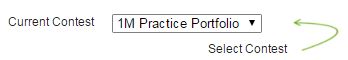
A – All will show all the orders you’ve created throughout your challenge. If you don’t see any orders and you think you should, don’t forget to check that you have selected the correct contest!
O – Open shows all the orders that are still trying to execute and get filled. Note: every pending order will automatically put the amount of cash you previewed aside while waiting to execute. F – Filled shows all the orders that have been filled and thus traded successfully. C – Cancelled shows all the orders that you or the system has cancelled. To cancel an order that is pending simply go to this screen and hit the cancel button in 2. Similarly, if you see system cancelled, it has been cancelled by the system for a variety of different reasons. This could be because the order broke a trading rule or less likely that we made some changes. X – Expired shows the order’s that expired, usually a market order or good til day order that expired automatically after not filling at the end of the day.
Order Filling – Trade
To have an order successfully go through – these conditions have to be met:
Volume – There must be enough trading volume for your order to execute. In other words, someone has to buy/sell the shares you sell/buy. The site will uses daily volume so the volume will be higher at the end of day.
Expiration – The order must be open.
Limit/Stop – The order must hit the target price you set if you used a limit or stop order.(note:this goes by bid ask, so even if the last price hit your target, the target must hit the appropriate bid or ask.)
Trading – The stock you are trying to trade must currently be trading.
!!!Note: Mutual Fund orders will always remain open until the end of the day. The trade will only go through at the end of the trading day, between 5:30 pm and 6:30 pm ET.
This term is generally used to refer to stocks with a price below $5. The name also comes from the fact that most penny stocks have either started or will end at $0.01 (a penny).
Detail
Penny stocks are extremely cheap stocks; so cheap that they usually do not follow the normal market capitalization rules of being listed on major exchanges, so are always traded OTCBB or through Pink Sheets. This is the main distinction between “Penny Stocks” and “Low Price Stocks”, like CitiGroup (C) or Sprint (S), which do sometimes trade under $5, but are listed on major exchanges because of the adherence to specific rules.
There are many reasons why a company could be traded as a penny stock. By far the most common are companies that issue an IPO to raise money, but the company ends up not growing or going completely bankrupt, with its outstanding shares still being circulated by investors in the hope it one day rises from the ashes.
Other examples include very large companies that come to the very edge of going out of business. Pier 1 imports falls into this category; during the height of the financial crisis it was looking at about $0.11 stock prices, but its stock has since recovered.
Occasionally penny stocks do “break out” and make it big: Monster Energy Drinks has been circulating under different names since 1936, and was trading below $1 as late as 1995 before its energy drinks caught on and business took off. However, most cases stay in the first category of stocks that never really go anywhere.
Difference between Penny Stocks and “Low Cost” Stocks
The major difference between the two types of stock is what drives price changes. For “Low-Cost” stocks, the behavior is the same as any other stock listed on a major exchange; the price may be more volatile, but it goes up with strong earnings and profits, and falls with bad news.
Penny stocks, on the other hand, often have prices shift through pure speculation; a flood of penny stock investors will sweep in to one stock over a short period, driving the price up, then start fleeing almost as fast, crashing the price back down. Penny stocks are very frequently the target of market manipulation; a small group of investors or “promoters” buy in to a stock, then try to attract as much attention as possible, and sell of their shares at the height of the hype. The investors who fell for the “hot tips” suddenly can find no new buyers for the shares they hold, making them worthless.
Companies who are represented by penny stocks can sometimes manipulate the prices themselves; it is not uncommon to see 10,000 for 1 reverse stock spits among penny stocks where the company wants investors to see a sudden jump in price to attract attention.
A main characteristic of penny stocks is a very high bid/ask spread (the difference between the minimum price someone is willing to pay for a stock, versus the minimum price a buyer would be willing to sell for), and extremely low volume; there can be days or weeks where a penny stock does not trade at all.
If you are considering investing in penny stocks, just remember that more fortunes have been made short selling penny stocks than buying them.
Definition: The amount of sales generated for every dollar’s worth of assets. It is calculated by dividing sales in dollars by assets in dollars.
Formula:
Asset Turnover = Revenue / Assets
Also known as the Asset to Turnover Ratio. More Detail: Asset turnover measures a firm’s efficiency at using its assets in generating sales or revenue – the higher the number the better. It also indicates pricing strategy: companies with low profit margins tend to have high asset turnover, while those with high profit margins have low asset turnover.
Day trading is the act of buying and selling (or shorting and covering) a stock or other investment in the same day.
Day trading has become a very popular way of making money. It can be very profitable or you could lose that money just as quickly as you made it.
Details
Difficulty
One of the greatest barriers to entry for day trading, not withstanding skills and knowledge, is the amount of money necessary to succeed. If we set a goal of beating the market (because otherwise it wouldn’t be worth the day trader’s time) he would have to make about 10% profit.
It means you would need more than $150,000 just to make minimum wage, without taking into consideration taxes (the capital gains tax owed on day trading is significant), cost of an office, equipment, and any analysis software you might be using. Even with that investment, only about 1 in 100 investors who day trade on their own turn a profit.
Another pitfall is that people wrongly believe that they can be just as good as the institutional investors because they can “get lucky”, or learn while doing. However, the greatest success can be found by either working through a day trading firm (and get access to their tools and research), and by using a simulator first to test your strategies.
Having what it takes
Let’s face it, day trading is not easy and can be very stressful. The following are some characteristics of good day traders:
Finance Knowledge – A wealth of knowledge of Technical Patterns, understanding how news affects stock prices and a very good understanding of the basics among others, is necessary.
Interest – You will need a strong interest to watch stocks and market news if you are doing this on a regular basis. If you do not have sufficient interest, the likelihood is you will quit before becoming profitable.
Perseverance – There can be very high high’s and very low low’s so it’s important to be able to persevere through the low’s.
Quickness – Day trading is measured in seconds and milliseconds, being able to react quickly and place trades quickly is essential.
Multi-Tasking – Just like being a fast trader, one must also be able to see and look at multiple different screens with large quantities of information to make quick and informed decisions.
Independence – Day trader’s frequently spend their time in front of a computer screen, oftentimes alone in their office. It can be quite daunting to have little human contact.
Managing Stress – As we stated earlier, day trading is stressful, more than many other jobs as there are constant demands for your attention and one big mistake could be incredibly costly.
Organized – Being prepared is also very important to day traders, a lot of the work can be done after the market closes at night or before the market opens in the morning. If you are not able organize and prepare your information before the chaos begins, it will be that much harder to manage.
Technologically Inclined – Charts, news feeds, trading screens, internet, these are all things that are absolutely necessary to get an edge on the competition in the day trading game. Without a technologically inclined mind, fixing internet problems and upgrading your layout to multiple screens could be quite daunting and expensive.
Tips
So you’ve decided to start day trading, what’s next?
Learning – What’s important is to start learning hands on as much as possible before losing your money learning. Then, once your consistently profitable, you can apply what you’ve learned without losing money while your learning.
Selection – One of the main challenges for a day trader is that stock prices usually change very little throughout the day and is usually reserved to the first few hours of trading. In order to make profitable trades you will need to find stocks with higher volatility, have sufficient volume and have a low enough price to be able to invest larger quantities of money and thus be able to buy more shares.
Spread – The other problem you must overcome is the bid/ask spread. Finding stocks that meet the criteria for profitable trades should also take into account the spread. A large spread with a liquidity problem could easily make even the most successful day trader lose money.
Commission Commission can be around 10$ a trade and can quickly eat your profit, especially if you only trading small amounts. Luckily, there are many different brokerages with cheaper commissions which are often based on how many trades you make, so it’s important to shop around.
Taxes and Businesses Day trading could be considered a business where you live and therefore require certain procedures to be followed before you start day trading, especially if you are investing other peoples money. Tax considerations can also be very important to the overall profit you make. It is very important to get informed about these before
Day Trading Rules – Don’t forget! Make sure to check the Day Trading Rules before opening a real brokerage account and day trading!
Definition:
Mutual Fund screeners are available on countless websites and trading platforms. They allow users to choose trading instruments that are suitable for certain criteria profile. Users will be able to screen for Mutual Funds by data as well as market capitalization, price, dividend yield also a 52-week price change percentage, typical volume and normal five-year return on investment (ROI). There are several trading platforms and software that allow users to screen utilizing technical indicator data. For instance, one can filter for Mutual Funds that are bargaining above their 200-day climbing average or whose Relative Strength Index (RSI) values are between a designated range.
More Detail:
By using an Mutual Funds screening tool, investors are able to find Mutual Funds that accommodate a specific set of criteria. Investors utilize screeners to Mutual Funds that are poised to be successful over time. If you’re an active trader, you may use stock screening tools to find high probability set-ups for short-term positions. These users may enter a variety of number of filters. As more filters are adapted, fewer stocks will be shown on the screener. Stock screeners grant investors and traders to examine hundreds of Mutual Funds in a short length of time, making it possible to draw ut those Mutual Funds that will not meet the user’s requirements and focus on the instruments that are within the user-defined metrics.
American investors, covering the past decade, have conclusively come around to mutual funds so they may save towards their retirement as well as other financial targets. Mutual funds may offer the benefits of diversification and professional management. However, along with other investment options, investing in mutual funds entails risk. Also taxes and fees will decrease a fund’s returns. It’s important to know both the upside and the downside of mutual fund investing and in what manner to select products that reflect your goals and acceptance for risk.
Advantages and Disadvantages
All investment has benefits and loss. Nevertheless it’s imperative to keep in mind the features that are important to one investor may not be valuable to you. Whether any specific feature is a certain usefulness for you will count on your individual circumstances. Mutual funds provide an attractive investment choice, American investors, covering the past decade, have conclusively come around to mutual funds so they may save towards their retirement as well as other financial targets. They may include the following features.
Professional Management — Expert money managers analyze, choose, as well as watch the performance of the securities the fund purchases.
Diversification — Diversification is an investing approach that has, at times, been summed up as “Don’t put all your eggs in one basket.” Broadening one’s investments across a variety of companies and industry sectors can assist in lowering your risk if a company or sector is unsuccessful. Many investors discover it’s easier to accomplish diversification by way of ownership of mutual funds instead of through ownership of individual bonds or stocks.
Affordability — There are several mutual funds that accommodate investors who may not have a bunch of funds to invest by fixing relatively low dollar amounts for subsequent monthly purchases, initial purchases, or both.
Liquidity — Mutual fund investors can quickly recover their shares at a existing NAV, as well as any fees and charges assessed on redemption, any time.
Mutual funds have features that some investors might view as disadvantages, for example:
Costs Despite Negative Returns — Investors are required to pay sales charges, annual fees, and other expenses no matter how the fund delivers. Relying on the timing of the investment, taxes may have to be paid on any capital gains distribution investors receive, despite whether or not the fund goes on to perform unfavorably when the shares were purchased.
Lack of Control — Investors normally are unable to determine the exact make-up of particular fund’s portfolio at any particular time, neither can they wholly influence which securities the fund manager sells and purchases or the timing of those trades.
Price Uncertainty — Pricing information for an individual stock can be obtained in real-time, or close to real-time, with comparable ease by looking into financial websites or also by contacting your broker. If you wish, you can check how a stock’s price revises from hour to hour, and if you want, from second to second. By comparison with a mutual fund, the price at which you buy or purchase shares will normally count on the fund’s NAV, which the fund may not compute until several hours after you have established your order. At least once every business day mutual funds have to calculate their NAV, normally after the major U.S. exchanges closes.
The possible choices for investing in a mutual fund is less complicated than you think. But how do you proceed or which one is the best for you based on your needs? Many people feel the same way.
Identifying Goals and Risk Tolerance Prior to selecting shares in any fund, as an investor you must first determine your goals and desires for the money invested. Do you want long-term capital gains, or perhaps a current income is preferred? How will you use your money? Towards payment of college expenses or to supplement a retirement a long time away? Recognizing a goal is valuable since it will help you to reduce the large list of over 8,000 mutual funds in the public domain.
Additionally, investors should contemplate the goal of risk tolerance. Will you as an investor be able to manage and rationally accept huge swings in portfolio value? Perhaps a more conservative investment is warranted. Analyzing risk tolerance is as vital as choosing a goal. Ultimately, what value is an investment if the investor cannot sleep at night?
Lastly, the topic of time horizon needs to be addressed. Investors have to consider the time frame they have to tie up their money, or if they expect any liquidity concerns in the relative future. This is important because mutual funds have sales charges and can take a big chunk out of an investor’s return over insufficient periods of time. Mutual fund holders should ultimately have an investment horizon with at least five years or longer
Style and Fund Type Perhaps as an investor you plan to utilize the money in the fund for a long-term need and you’re willing to estimate a reasonable amount of volatility and risk, then the objective one may be appropriate is a long-term capital appreciation fund. These types of funds are considered to be explosive in nature and usually sustain a high allotment of their assets within common stocks. There is a likelihood for a big reward over a period of time. As an alternative, in case the investor needs their current income, they could obtain shares in an income fund. Two of the more common holdings in an income fund are government and corporate debt. There are instances, of course, when an investor has a longer-term necessity, but is against or unable to assume considerable risk. In this instance, an equal fund that contributes in stocks and bonds perhaps be the best choice
Charges and Fees Mutual funds will make investors pay for fees, this is how they make their money. To understand the various kind of fees that you may encounter when acquiring an investment is essential. Several funds charge a sales fee known as a load fee, which can either be charged upon the sale of the investment or at the initial investment. A back-end load fee is required when an investor sells the investment made by the investor, while a front-end load fee is paid out of the original investment . For the most part, this is usually done before a set time period, like seven years from the purchase. The front-end and back-end loaded funds usually charge 3% to 6% of the full amount invested or allocated. Every now and then, this number can go as high as 8.5% by law. The intention is to cover any administrative fees and hinder turnover associated with the investment. Depending on the mutual fund, fees can go towards the broker for selling the mutual fund or towards the fund itself, sometimes resulting in lower administration fees at a later date.
To prevent these sales fees, keep an eye for no-load funds. These will not charge a front-end or back-end load fee, be aware other fees in a no-load fund. A good example is the management expense ratio as well as other administration fees, as they can be rather high. Several other funds charge 12b-1 fees, which are included into the share price and are utilized by the fund for sales, promotions and other activities associated to the distribution of fund shares. These fees come right off of the disclosed share price at a proposed point in time.Accordingly, investors are at times not aware of the fee at all. The 12b-1 fees by law can be as much as 0.75% of a fund’s average assets annually. An important tip when analyzing mutual fund sales literature, the investor should be attentive for the management expense ratio. Actually, that one number can benefit in clearing up any and all confusion as it relates to sales charges. The ratio simply is the total percentage of fund assets being charged to cover fund expenses. The higher the ratio, the lower the investor’s return will be at the end of the year.
Evaluating Managers and Past Results As you would do with all your investments, investors must analyze a fund’s past results. The following is a sample list of queries that future investors should research when reviewing the historical record:
Did the fund manager deliver results that were in keeping with general market returns?
Was the fund more explosive than the big indexes (did it’s returns change drastically throughout the year)?
Was there an extremely high turnover (which may result in bigger tax liabilities for the investor)?
This information is imperative since it will give the investor awareness into how the portfolio manager reacts under certain conditions, and what the trend has been in terms of turnover and return. Just remember, past achievements have no guarantee towards future results. So before buying into a fund, be sure it makes sense to look over the investment company’s portfolio to examine any information regarding anticipated trends in the market for the years ahead. Most of the time, a impartial fund manager will help the investor with some sense of the prospects for the fund and/or of it’s holdings throughout the year(s) in the future as well as let you know about general industry trends that could be helpful.
Size of the Fund Normally, the amount of a fund does not slow down its competency to meet its investment goals. Moreover, there are situations when a fund can be too big. Back in 1999, Fidelity’s Magellan Fund, topped $100 billion in assets and they were forced to adapt its investment procedure to accommodate the large daily money inflows. Rather than being smart and purchasing small- and mid-cap stocks, it changed its center of attention largely towards larger capitalization growth stocks. As a result, its performance suffered. When should you worry that big is too big? There are no benchmarks that are definite, however that $100 billion mark really makes it hard for a fund manager to get a position in a stock and dispose of it without dramatically running up the stock on the going up and pushing it on the way down. It makes the procedure of buying and selling stocks with any kind of obscurity almost impossible.
The Bottom Line Choosing a mutual fund seems like a frightening task, just know your objectives and taking a chance is half of the battle. Be sure to follow this tip of due diligence prior to selecting a fund, you will increase your chances of success.
Mutual fund charges and costs are fees that may be acquired by investors who possess mutual funds. Managing a mutual fund involves costs, including investment advisory fees, shareholder transaction costs, and marketing and distribution charges. These funds are passed along as costs to investors in various ways.
Other funds set “shareholder fees” straight onto investors whenever they purchase or sell shares. Additionally, all funds have common, continuous, fund wide “operating expenses.” Funds normally pay their operating expenses out of fund assets, which means that investors indirectly are charged for these costs. Apparently insignificant, fees and expenses may substantially reduce an investor’s earnings.
Types of Fees Redemption fee:Redemption Fee is substitute fee that a few funds charge their shareholders when they sell or recover shares. Contrary to a deferred sales load, a redemption fee is yielded to the fund – not to a Stockbroker – and is normally used to bear the fund costs associated with a shareholder’s redemption.
Purchase fee: Purchase Fee is a kind of charge that some funds have their shareholders pay when they purchase shares. Unlike a front-end sales load, a purchase charge is paid to the fund – not to a Stockbroker – and is normally infringed to defray a bit of the fund’s costs connected to the purchase.
Exchange fee: Exchange Fee is a fee that some funds set on shareholders if they trade or move to a different fund within the identical fund group or “family of funds.”
Periodic fees
Management fee: Management fees are charges that are distributed out of fund assets to the fund’s investment adviser. These go towards investment portfolio management and any other management charges payable to the fund’s investment adviser or its affiliates. The administrative fees payable to the investment adviser are not included in the “Other Expenses” category, they are discussed below. They are also called maintenance fees.
Account fee: Account fees are charges that some funds individually impose on investors in association with the maintenance of their accounts. As an example, several funds require an account maintenance charge on accounts whose value is smaller than a certain dollar figure.
Other operating expenses
Transaction Costs: Funds with a large turnover ratio, or investing in unready cash or exotic markets normally face higher transaction costs. These costs are incurred in the trading of the fund’s assets. The Total Expense Ratio costs are normally not reported.
Loads
Definition of a load: A load is a type of commission. Load funds show a “Sales Load” with a percentage fee imposed on acquisition or sale of shares. Fees may be incurred at point of purchase or sale depending upon the kind of load a mutual fund exhibits, or it can be a mix of both. The different types of loads are outlined below.
Front-end load: This is frequently affiliated with class ‘A’ shares of a mutual fund. This can also be known as Sales Charge. This is a charge paid when shares are acquired. Also known as a front-end load, this charge typically is distributed to the brokers that sell the fund’s shares. Front-end loads shrink the quantity of your investment. Let’s say you have $1,000 and you’d like to invest it in a mutual fund with a 5% front-end load. The $50 sales load you have to pay comes directly off the top, and the balance of $950 will be invested in the fund. The maximum sales load under the Investment Company Act of 1940 is 9%. The highest sales load under NASD Rules is 8½%.
Back-end load: Deferred Sales Charge, which is a fee paid when shares are sold. These are associated with class “B” mutual fund shares. They are also known as a back-end load, this fee normally goes to the Stockbrokers that trade the fund’s shares. Back-end loads begin with a charge of about 5 to 6 percent. These increment discounts are for each year that the investors owns the fund’s shares. The rate at which this charge lessens is shown in the prospectus. The amount of this kind of load depends on the length of time the investor possesses his or her shares and normally decreases to zero depending on if the investor hangs on to the shares long enough.
Level load/low load: It’s a lot like a back-end load in that no sales charges are paid when purchasing the fund. Rather a back-end load can be imposed if the shares bought are sold within a given time. The difference between level loads and low loads in contrast to back-end loads, is that this timeframe where charges are levied is shorter.
No-load fund: These are associated with Class “C” Shares. As the name suggests, this fund does not charge any type of sales load. However, as noted above, not all types of shareholder fees are a “sales load.” A no-load fund can charge fees that are not sales loads, like as exchange fees, purchase fees, account fees, and redemption fees. The Class C shares will have the highest annual expense charges.
Core/Satellite
This plan of action is a combination of index and active investing. Index investments, like ETFs, become the bedrock of the portfolio’s construction as well as intensely administered investments are added as satellite positions. Investors index their center holdings to more effective asset classes and restrict their choices to active managers that deliver consistent alpha or out performance for added categories. Most large pension plans today utilize a core or satellite approach in their investment policy and countless individual investors are starting to have similar approaches.
Hedging
ETFs are productive hedging tools for administering risk. Take for instance, investors will be able to guard against over concentrated equity positions by utilizing ETFs as single stock substitutes. This type of hedge technique can decrease risk and volatility by allowing stockholders to diversify elsewhere from larger equity positions to companies that own or work at. Inverse performing or short ETFs allow investors to hedge against a market decay.
Leverage
ETFs can be leveraged with margin like individual stocks. Margin is acquiring money from a broker to purchase securities, it involves considerable risk. Minimum maintenance requirements are administered by the FINRA (Financial Industry Regulatory Authority), by the NYSE and by individual brokerage firms. While margin investing can make money for investors correct, the interest charges or borrowing costs can deteriorate returns.
Options
ETF investors have an abundance of option strategies available. Purchasing call or put options can be an ambitious method. By paying a premium, an options investor will be able to control a large amount of ETF shares. The premium price is a small portion of what it would cost to buy the shares in the open market. This supports an options investor with a great amount of leverage and a high risk or reward opportunity.
A more aggressive way utilizes put options in combination with portfolio holdings. Purchasing protective puts on ETF positions will insure a portfolio against declining prices. There are other tactical possibilities with options.
Shorting
ETFs can be shorted just like individual stocks. Shorting includes selling borrowed shares an investor does not currently own by assuming the price of an ETF will lessen in financial worth. However, if the ETF does decrease in financial worth, it can be purchased by the short seller at a lower price, which results in a profit. Shorting individual stocks on a downtick isn’t acceptable. But ETFs are an exemption to this rule. This translates into easier and fluid short selling with ETFs.
Shorting is an advanced technique and involves substantial risk.
Sector Rotation
Convenient market exposure to various industry sectors is easily found with ETFs. By carefully shifting assets, investors may over and underweight distinct sectors according to their economic outlook, market objective or financial research. Possessing or exchanging concentrated business segments lets ETF investors capitalize on both the positive and negative sector trends.
Tax Loss Harvesting
Wash-sale rules wouldn’t allow investors to apprehend a stock deficiency if they repurchase the identical stock within a 30 day period. This situation can be prevented with smart tax loss planning. By transferring the loss earnings into an ETF in the identical sector as the stock, i.e., the wash-sale rule may be prevented. This will allow investors to counterbalance any capital gains with capital losses and continue to maintain market exposure.
Definition: A closed-end fund is a publicly traded investment company that raises a fixed amount of capital through an initial public offering (IPO). The fund is then structured, listed and traded like a stock on a stock exchange. More Detail: Despite the name similarities, a closed-end fund has little in common with a conventional mutual fund, which is technically known as an open-end fund.
The former raises a prescribed amount of capital only once through an IPO by issuing a fixed number of shares, which are purchased by investors in the closed-end fund as stock. Unlike regular stocks, closed-end fund stock represents an interest in a specialized portfolio of securities that is actively managed by an investment adviser and which typically concentrates on a specific industry, geographic market, or sector. The stock prices of a closed-end fund fluctuate according to market forces (supply and demand) as well as the changing values of the securities in the fund’s holdings.
Definition:
An open end mutual fund don’t have limits on the quantity of shares the fund will issue. Provided that demand is requested often, the fund will continue to issue shares no matter the number of investors. Open-end funds likewise will purchase back shares when investors would like to sell.
More Detail:
The large amount of mutual funds are open-end. By constantly buying and selling back fund shares, the funds will provide investors with a useful and convenient investing tool.
Please note that when a fund’s investment manager decides that a fund’s total assets are becoming too large to adequately accomplish its stated objective, the fund will be cut off to new investors and in extreme cases, be shut off to new investment by existing fund investors.
Screeners (or Stock, ETF, Mutual Fund, Bond, etc Screeners) are a software that were once primarily used for stocks to help find a stock that corresponded to certain criteria. Nowaydays Screeners have been extended to all sorts of asset classes (even real estate if you think about it). There are large numbers of stock screeners and are available on most financial websites. More powerful screeners can allow to search with more criteria as well as more advanced and complex criteria.
As an example, if we wanted a very large company with high dividends. We could search in a stock screener for a high dividend yield and a large market cap. Similarly if you wanted to start day trading you could look for stocks with a very high volatility and liquidity. Most likely one of the most common searches are done to find favorable ratios (such as P/E, current and turnover ratios).
Given the huge number of stocks and ETF’s out there a stock screener is a must when trying out specific investment strategies.
Definition: A load mutual fund comes with a sales charge or commission. To compensate a sales intermediary (ex: a broker, financial planner, investment advisor) for their knowledge and time in choosing a suitable fund for the investor, the fund investor will pay the load. The load is either paid prior to the time of purchase (front-end load), or when the shares are sold (back-end load), or as long as the fund is in possession by the investor (level-load).
More Detail: To be considered a “no-load” fund, the fund will limit its level load to no more than 0.25% (the maximum is 1%), it will be located in its marketing literature.
Front-end and back-end loads are neither part of a mutual fund’s operating expenses, however level-loads, called 12b-1 fees will be included. The annals show that the performance of load and no-load funds are very much alike.